top of page
Eventie
Bringing students together
Type
Class project
Role
UX/UI Designer
UX Researcher
Time
8 weeks
Delivery
Functional prototype
About
During this eight-week project, I, along with three other students, designed, from conception to digital prototype, an application that aligns with the 2019 CHI’s Student Design Competition prompt of strengthening social fabric and enhancing interactions between individuals and communities. The prototype was designed using Figma.
Eventie aims to help students at the University of Michigan browse and connect with organizations that interest them on campus.
Problem Statement
The current methods of finding clubs on the University of Michigan’s campus are frustrating. Students run into out-of-date websites, past Facebook events, and inactive social media accounts of many organizations on campus, hindering the ability to join these clubs or attend their events.
Currently, tools like Maize Pages, Facebook, and the Michigan App offer somewhat of a bridge to connect organizations and students, but nothing is intuitive, up-to-date, or accurate. There is also no way of filtering school organizations by student interest on any existing platform.
The goal is to create a single application that consolidates all campus club information and events to allow students to find clubs based on their interests and stay in the loop for meetings and events. This will hopefully remediate the disparity between a student and the many on-campus clubs the University of Michigan has to offer.
Competitive Analysis
Direct Competitor:

Why:
Its goals and implementation are very similar to what we want to create in order to link students with campus club events.
Advantages:
Functionality: students can use it to search and filter through events.
Disadvantages:
Poor interface, low standards for event information and maintenance, lack of engagement from organizations on campus, and contact information for many organizations is out of date, providing false information for students.
Filtering:
• Unclear how events are organized by default
• No built-in personalization
• Users can search and filter by Dates, Themes, Categories, and Perks
• Users can click on an event to get additional information and integrate events with iCal or Google Calendar.
Analagous Competitor:

Why:
MindBody serves as a platform to connect people to a variety of services including health, wellness, and beauty specialists.
Advantages:
Offers features such as seeing the time, date, and location of events, the ability to add favorites, add events to a calendar, set reminders for events, and have updated contact information.
Disadvantages:
Lack of feedback when using the application.
Filtering:
• Allows searching for a certain service, ie yoga, and the search results return with yoga studios in the user’s area.
Personas
Based on project goals and research, two personas were created. They served as a reference point to what kind of people would be using the app and what it needs to include and solve. For the personas, basic information, goals, frustrations, and quotes are included.


Scenario
It’s the second week of Adam Jones’s freshman year. He wants to find a club event to attend this week. Adam refers to our platform in search of an event. It’s his first time using it so he fills out some information about himself and his interests. He chooses to add interests to his profile like Volunteering, Nature, and Sports. He saves his profile and starts looking through this events this week that are suggested to him. He finds an event for Michigan Climbing Club where he can try out rock climbing on Saturday at 7pm. He RSVP’s for the event and adds it to his calendar so he won’t forget. He also follows Michigan Climbing Club in case they host any other events he might be interested in later.
Goals / Tasks Successfully Completed with our platform:
-
Found events tailored to his personal interests.
-
Added event info to his personal calendar.
-
Signed up to get more information in the future.
Sketches
The design process began with sketches to iterate through many ideas quickly, providing options for presenting the information. The sketches gave a better idea of potential interactions to include in the app.


Storyboards
Storyboards were then created to further shape user journeys. The storyboards were used to show some of the ways students might use the app and help develop requirements for the application.
User Flow Diagrams
User flow diagrams show how a user would move through the application and how the screens would interact with each other. Because there are two types of users (students and clubs), there are two main pathways.
User Flow Simplified

Club representative:
Create Profile, Add/Edit Event

Student:
Create Profile + Browse

Student:
Add Event

Student:
Look at Club



Wireframes
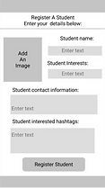
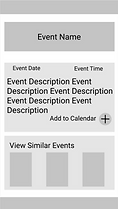
Sketches were then turned into wireframes, using Figma, to see the layout on a computer. These wireframes made it easier to visualize design ideas and adjust accordingly. The designs were used for paper prototype testing.
Paper Prototype
Turning our wireframes into a paper prototype helped our team feel the flow of the design and determine if our sequential actions made sense. From testing the prototype, we made several key design decisions and discovered possible improvements.
Key Takeaways from Testing:
-
Include a calendar page for events. This calendar page will show all the users’ events in one centralized location. This is accessible from the second icon on the navigation bar on the bottom of each page.
-
Make a student profile page for each user. They can see the clubs they are a part of, upcoming events, their interests, and the information that is unique per user. This will be accessible from the last button on the navigation bar.
Added back arrows to allow the user to go back and forth between pages to reduce confusion.
Made every button/call to action a circle to provide consistency for users and to make the interface more intuitive.
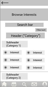
The navigation icons we chose are common icons that are easily recognizable, such as a house for the homepage, and person silhouette for the profile page.
Digital Prototype
We then developed our paper prototype into a digital prototype. This brought the feel of the prototype closer to the final design and gave users a better understanding of the application for testing. From testing the prototype, we made three key design improvements.
Key Improvements:

Added interactive filter differentiation between clubs and events when browsing for more precision.
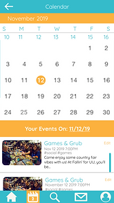
Added visual calendar within Calendar page instead of a list of upcoming events for better understanding.

Added ability to switch accounts to make it easier for users who are both a student and a club owner.
Final Design
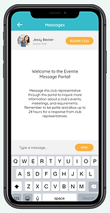
Taking what we learned from testing the digital prototype, we made upgrades to our design leading us to our final design.


Final Takeaways
From this project, I learned that there is a significant gap in ways to connect with clubs on the University of Michigan campus. Through this process, I discovered that students want customizable options for filtering through potential events and clubs to join. They also want a centralized location to keep track of their events due to their already busy schedule. These realizations guided the design and led to the final design.
bottom of page